When you drive a car, you need a few key indicators (speed, the gasoline level, lights, etc.) to clearly understand the situation within seconds and simple enough to know what action to take. The same is with building dashboards – you have to put the right things in the right place to make it work. But how to know where is the right place? What colors and what layouts work better? Here are some tips that will help you to decide. Let’s talk about User experience and the way from report idea to the satisfied end-user who appreciates your work.
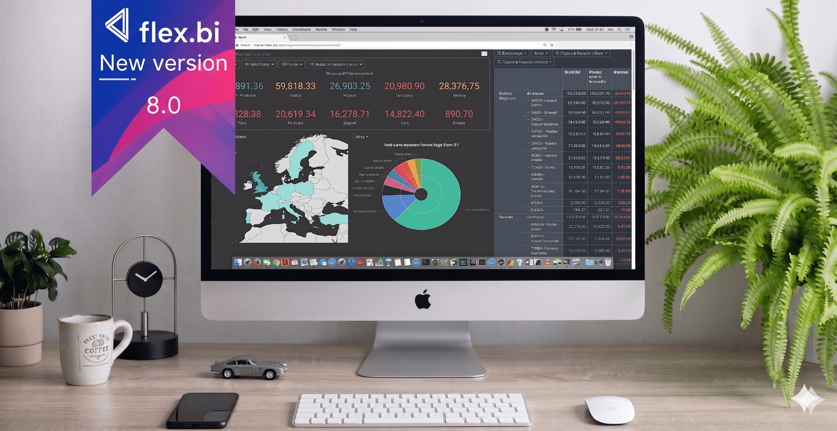
8 min read
Different people in the company ask for different reports and soon you may fall in a trap of creating dashboards full of meaningless non-related information. The opposite is a dashboard that shows too little or a user that is not trained accordingly but trying to use the Dashboard. This guide will assist you on your way to Dashboards that are showing the most relevant information in an engaging manner and actually helps users to save time and make the right decisions faster not waste their time clicking around.
1. UNDERSTAND USER NEEDS & HABITS
Have you ever built a dashboard that looks nice, but somehow nobody wants to use it? I have. Also, I have been asking users the reasons for that. The majority of the cases it happens to be – hard to access, hard to understand, lack of training. All those things you can fix if you start building dashboards for real people, with real needs, respecting their habits. Knowing the habits of your users will help you to publish the information in the most suitable way for them.
| So the first step in organizing your dashboard initiative must be identifying what you want to achieve with your dashboard and who are the users you are planning to impress? If you cannot answer those questions, the chance of success is quite low. Different groups of people will have different habits- some like to ask questions, some want everything ready for them. Some get excited when they see a big list of numbers (CFO?), some get bored very easily and are sensitive to too much information. Also, you have to understand the nature and context of the problem that they have in mind, only then you can solve it. How often they have this problem? Who else is involved or related to this issue? | 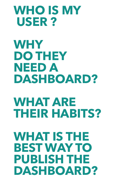 |
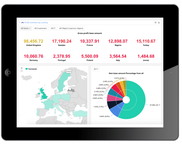
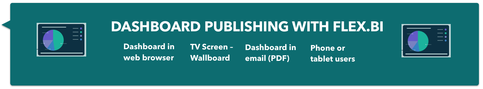
User interaction levels with reports and the device they will use to access them will define publishing options you should choose. Web browser access will be useful for those who are planning to analyze numbers on daily basis and will want to Drill into related data. TV Screens will work for those who have a short attention span and like colorful, dynamic things. Also displaying company results in the background for all employees will help them to feel connected with company targets, feel safe, and motivate them to be proactive. Scheduled Dashboards in email is for those who keep forgetting things. It is great to be reminded about company target when you can still fix things not when it is too late.
USER HABITS AND SOLUTIONS FOR THEM
| Name | Position | Notes | Rules |
| Ben | Sales manager | Always looking for something new, gets bored easily. | Dashboards must be colorful and dynamic. Not too much information. |
| Does not like routine jobs and tries to escape them. | Send Dashboard in email or use TV screens in sales department. | ||
| Michael | CEO | Hates to talk about unrelated topics, likes getting answers fast. | Only relevant KPI’s he has asked for in a simple overview. |
| Plans the future of company. | Future trend dashboard sounds like good idea. | ||
| Makes operational decisions. | Dashboard needs to have simple ways to navigate to detailed view and filter data. | ||
| Jennifer | CFO | Always prefers to know where numbers are coming from. | Introduce her to Drill trough, Drill Across, Drill Into functions. |
| Excel expert, likes to do things herself. | Teach her how to remove/add new columns and build/modify reports. |
2. IDENTIFY DASHBOARD TYPES
If you know what type of dashboard you are building it is much easier to choose what should be placed in it, how often data should be refreshed.
Strategic Executive Dashboards – track key performance indicators.
Example: Used on a periodic basis, to make sure that the team is going in the right direction. These dashboards are used to make changes in strategic planning.
Users: executive team
Data: can be updated periodically or on request
Operational Dashboards – tell you what is happening now.
Example: in a business with an active sales process it would be the amount of leads generated this month, sales calls done and future meetings planned. This type of dashboard would show the health of the current situation taking into account the company’s long term goals and targets.
Users: all team members
Data: require real-time data and have to be seen and used every day
Analytic Dashboard – process data to identify trends and predict outcomes.
Example: in a business with an active sales process it would be the amount of leads generated this month, sales calls done and future meetings planned. This type of dashboard would show the health of the current situation taking into account the company’s long term goals and targets.
Users: specialists, data analysts
Data: usually based on historical data and may be updated infrequently
| Dashboard name | Business need | Users | User interaction | Access | Dashboard type |
| Company overview | Company strategic goals and KPI’s. Long term planning. | Michael, Jennifer | High | Web browser, phone | Executive dashboard |
| Sales dashboard | Data awareness and time sensitive data. Up to date company pulse. | Ben, Michael | High | Web browser, phone, TV screen | Operational dashboard |
| Customer analytics | Detailed lists of indicators. | Ben | Low | Web browser | Analytic dashboard |
| Company budget monitoring | Future planning. | Michael, CEO, Jennifer, CFO | Low | Web browser | Operational dashboard |
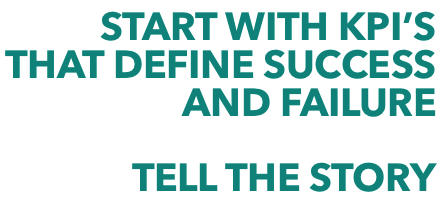
3. CHOOSE ONLY KPIs THAT MATTER
| “In simple terms a KPI is a way of measuring how well we as individuals or how well entire companies or business units are performing. KPI is short for Key Performance Indicator. A KPI should help us to understand how well a company, business unit, or individual is performing compared to their strategic goals and objectives.” See KPI Library |
| The wrong KPIs bring the danger of pointing people in the wrong direction and even encouraging them to deliver the wrong things. Always remember, the reason why KPIs are so powerful is that ‘you get what you measure’. If a company measures and rewards the achievement of KPIs that are not in line with their goals then it basically asked the crew to sail in the wrong direction! Read full article “What The Heck Is a… KPI?”, Bernard Marr | |
| Identify your most important goal and several KPIs that support it. • Start simple, then build on your success with more complex goals. • Ask stakeholders what metrics are most important to them. • Focus on collecting data that is actionable and related to each KPI. |
 |
4. PLAN THE LAYOUT
Why it is important? The bad layout will make users lose interest, spend more time reading data, or even abandon dashboards. Bad layout dashboards fail to deliver the value.
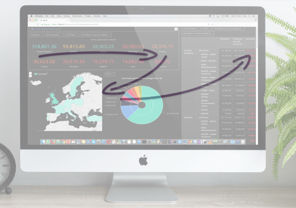
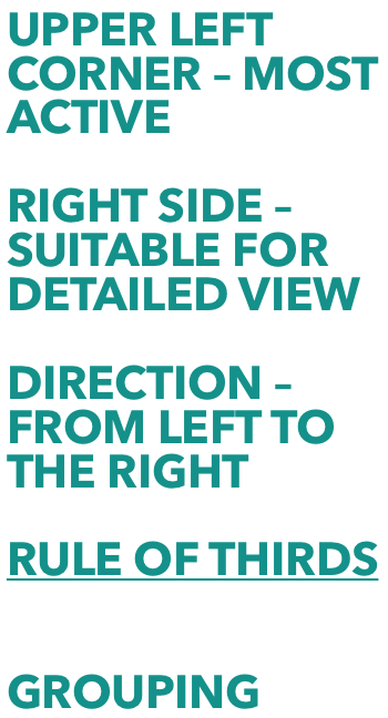
No matter which layout you choose, structure your information to draw the eye to the things that matter the most. Position the most important information where your audience will look first. People tend to scan a page starting at the top left, read from left to right, and focus on the left side (in Western cultures). The bottom and right side are not as prominent.
 |
 |
5. CHOOSE CHART THAT SUITS DATA
Why it is important? A wrong graph can make data hard to read or give wrong impressions that lead to wrong decisions.
To determine which chart is the best suitable, first, you must answer a few questions:
• How many variables do you want to show in a single chart? One, two, three, many?
• How many items (data points) will you display for each variable? Only a few or many?
• Will you display values over a period of time, or among items or groups?
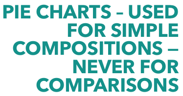
Bar charts are good for comparisons, while line charts work better for trends. Scatter plot charts are good for relationships and distributions, but pie charts should be used only for simple compositions — never for comparisons or distributions.
Read more about How to pick the right chart type, eazyBI

 |
 |
 |
 |
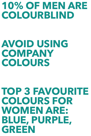
 6. COLORS – TYPICAL COLOR RELATED MISTAKES
 6. COLORS – TYPICAL COLOR RELATED MISTAKES
Over-using highly saturated and intense colors
If a dashboard is full of highly saturated colors, everything is demanding attention, so users don’t know what to look at first. They end up feeling overwhelmed. Choose what is most important and keep emphasis clear.
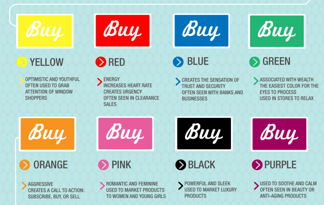
Using different colors to represent the same item on different charts
In a dashboard, consistency is important. It reduces the mental effort users have to make to understand what they are seeing. If you use blue to show a turnover increase and red for lost customers, then do it in all dashboards the same way.
Misusing traffic light colors
If you are using red and green as “bad” and “good” in your dashboard, do not use it for anything else.
 |
 |
7. LAST BUT NOT LEAST – PLAN YOUR DASHBOARD MAINTENANCE
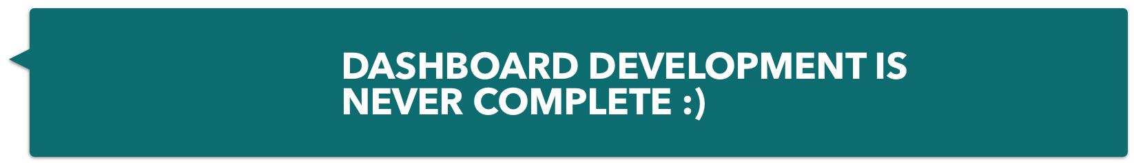
Even if your dashboard initiative can be considered successful, it’s never finished. In fact, proper monitoring and maintenance is just as important as setting up your dashboard correctly in the beginning.
During development, you’ll need to have a plan to maintain your dashboard once it’s launched. This means keeping data up-to-date, monitoring KPIs, and refining your dashboard and data strategy as the initiative moves forward.
• Stay in contact with stakeholders; ask them what’s working and what could be improved.
• Set a specific time frame for each KPI, revisit them, and modify your strategy if necessary.
• Pay attention to projected data, identify potential challenges, and create a plan to avoid them.