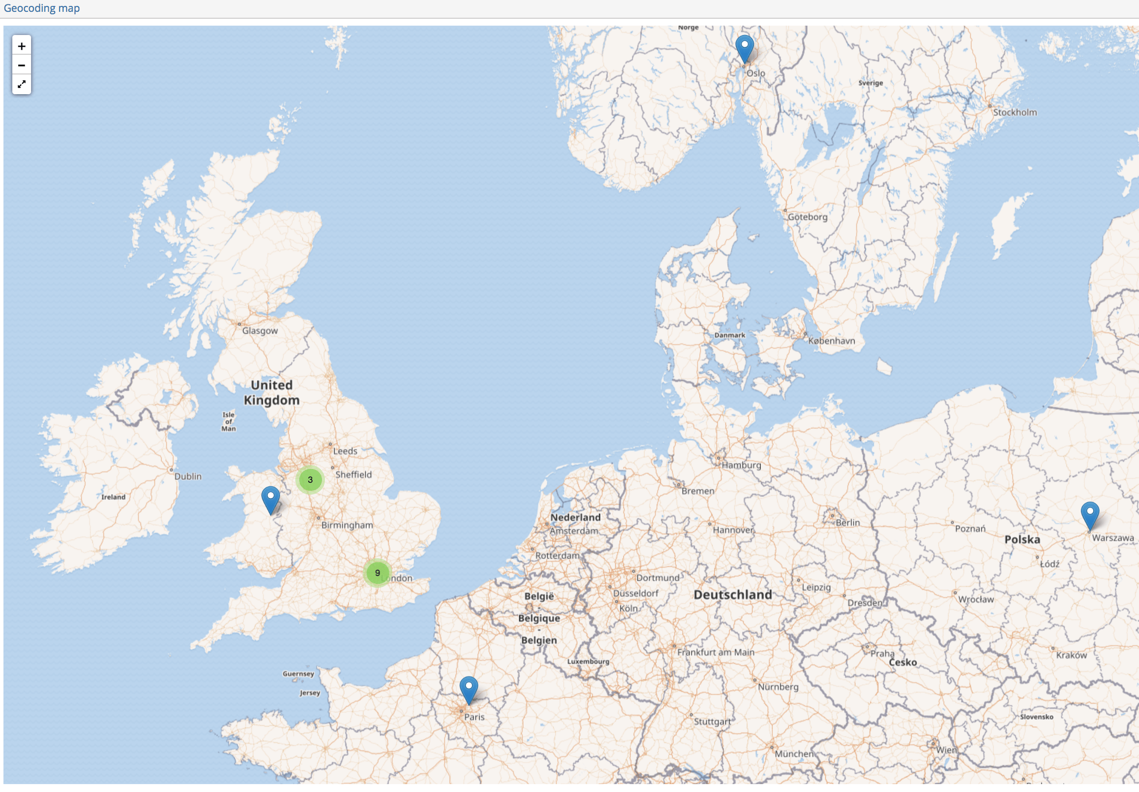
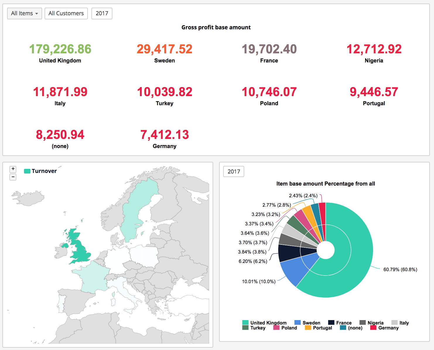
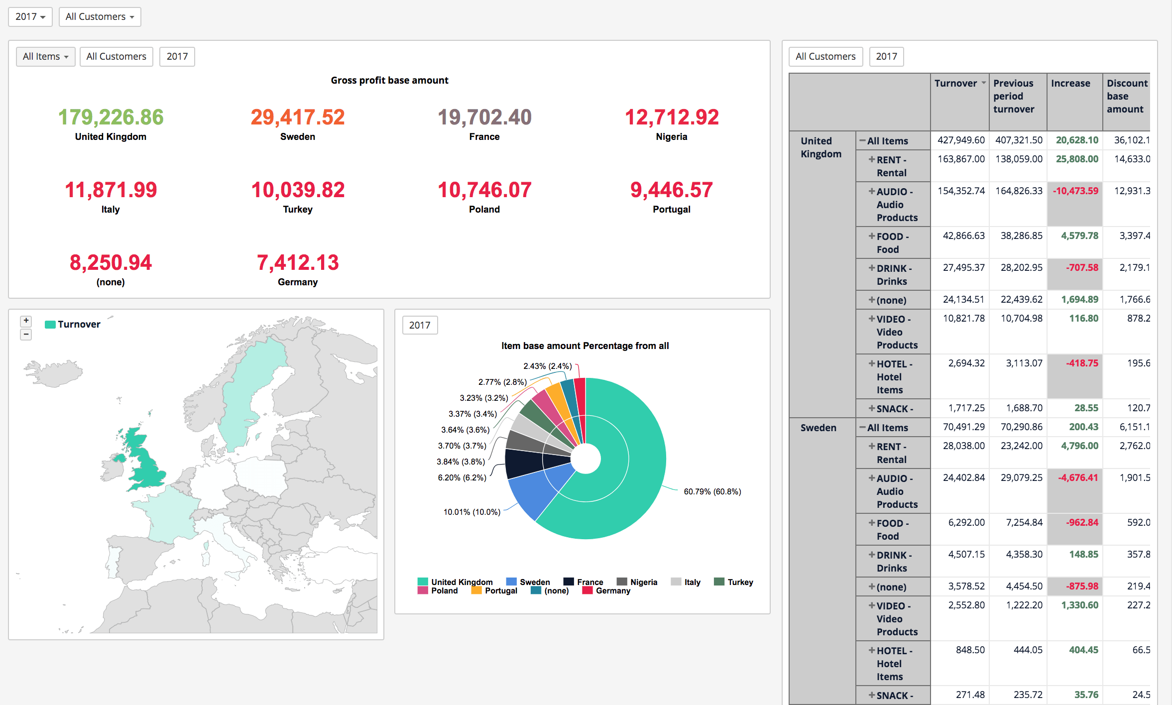
Geographical data representation
Maps can be used to show geographical distribution of stores, warehouses, offices and other sites of business interest. You can visualize not only locations but also sales values and other measures and display the value differences by bubble size or color.
Advantage: A map is a versatile visualization that efficiently presents the geographical distribution of key values related to location or area.
Disadvantages: When there is large number of values, it might be hard to get a good overview – values might be overlapping and hard to distinguish until zoomed in.
There are many reasons to put your data on a map. Perhaps you have some location data in your data source? Or maybe you think a map could really make your data pop? Both of those are good enough reasons to create a map visualisation, but it’s important to keep in mind that maps, like any other type of visualisation, serve a particular purpose: they answer spatial questions. A map can help to understand the trends and patterns in your data (but you must remember that a map chart is not always the best way to find answer for a spatial question).
Read how to create a Map chart (ir dokumentācija par to, kā uztaisīt Map charts, bet nav īsti labas lapas, kas pastāsta, kas tas ir, kad map charts labāk izmantot, utt.)